REVEAL: Bridlemile Midcentury Living Room/Dining Room
- Tamara Wise
- Jan 24, 2019
- 3 min read
We are so excited to share the design process for our gorgeous Bridlemile Midcentury renovation with you! This project started with furnishing our clients' living room and adjoining dining room. Our clients wanted an 'adult' space, allowing friends and family to be entertained in comfort.
The living room/dining room space was a blank slate as the clients had moved from a small one-bedroom (+loft) home and had placed most of their previously-owned furniture in the kid-friendly basement family room. The space had large windows with lovely expansive views, however the division between the living and dining room was undefined and somewhat awkward.
Our task was to create a sophisticated space, great for accommodating guests - utilizing kid-friendly fabrics and materials all with the clients' budget in mind. Not an easy challenge, but it helped that our clients had a clear goal and open minds!
Here is a look at the space before the project started. The room was nice and open with a gorgeous view, but lacked definition between the living room and dining room area.
Bridlemile Midcentury Living Room/Dining Room Before Photos


We pulled together some inspiration photos to guide us aesthetically. It helped that we had the fireplace to anchor the living room space, so that we could clearly define the living room area. We also knew that we wanted to keep the furniture in a more traditional/formal orientation, to create the sophisticated feel. We narrowed our options down to this gorgeous living room designed by The Design Co.
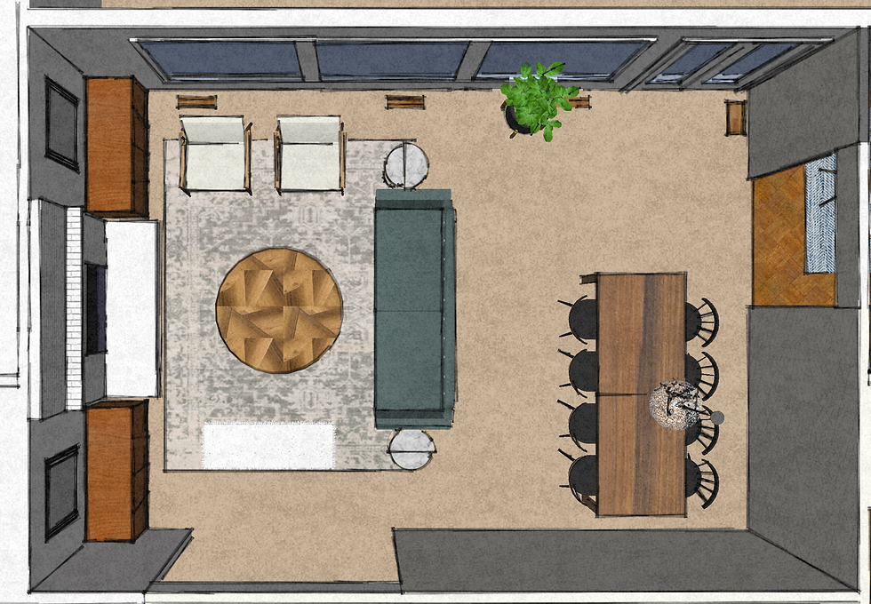
After we had our inspiration, we got to work on a functional furniture layout for the room. Again, we wanted to create a nice flow between the spaces, yet also create some division between the living and dining room. Working with the clients we chose from 2 space plans and landed on a layout that attained all of our goals.

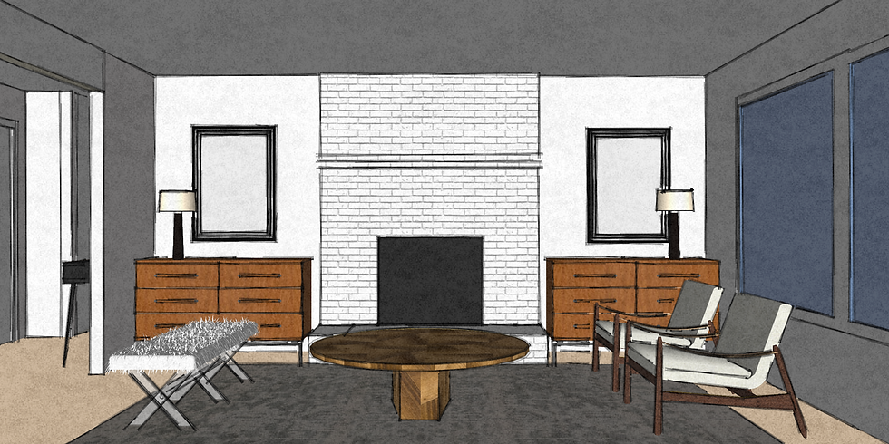
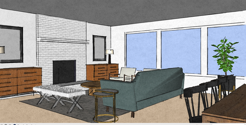
After we had our furniture layout, we created a 3D model to ensure we had the correct dimensions and to get a sense of what furnishing items we would want to start sourcing.


We started to hone our palette and materials for the room (it's a process!). As we developed our 3D model, we also started sourcing the furniture and accessories for the space (also a process)!

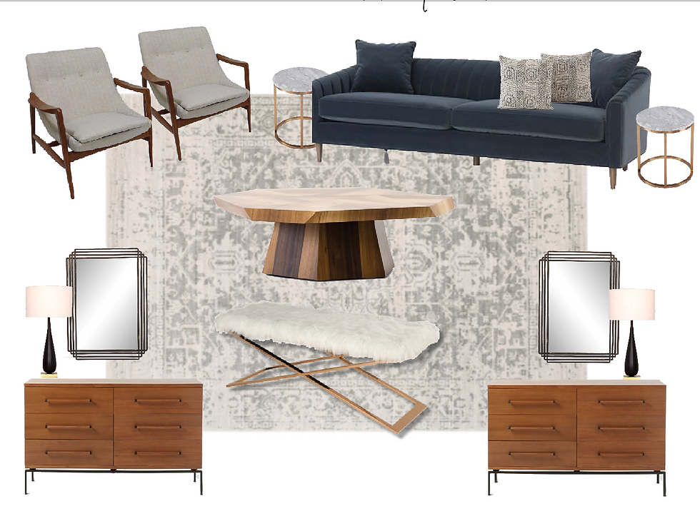
Once we landed on all our furnishing items, it was time to present our ideas to the clients. We used images from the model, mood boards and tear sheets of the actual items we were specifying to share our design intent.

For the living room, we chose a classically shaped blue velvet sofa, a large neutral (and kid friendly!) rug, Danish style side chairs, shiny brass side tables, mid-century credenzas along with mirrors & lamps to flank the fireplace and a gorgeous statement coffee table!

To differentiate the dining room from the living room, we chose a beautiful and subtle geometric wallpaper. We paired this with a clean-lined walnut dining table and black Windsor style dining chairs. To top it all off, a unique black mesh pendant was placed over the dining table.
Lucky for us, the client's loved everything! With a few minor tweaks, we began placing our orders. We were up against somewhat of a deadline with the holiday season coming up and it was challenging to get the items there before Christmas. We selected items that were quick ship or in-stock, and most things arrived on time.
Our design slowly transformed from 2D/3D to real life and our clients couldn't have been more thrilled! Their once bare living room was now a cozy, yet sophisticated space for all of their friends and family to enjoy!
Stay tuned for our post next week, where we'll be discussing the transformation of a very dated & unique bathroom into a stunning, airy space for this Bridlemile Midcentury project!
Check out this project featured in the Winter Edition of Oregon Home.


