REVEAL: Irvington Dutch Colonial Kitchen
- Tamara Wise
- Feb 14, 2019
- 2 min read
This week we're introducing you to a new space, our Irvington Dutch Colonial kitchen! What a journey this classic beauty went through to return to its former glory. Now this kitchen feels authentic to the architecture of the home. However, it was not always that way...
Here is a bit of backstory on the home and client...
Our client had a unique relationship with this Dutch Colonial home. Located in the distinguished Irvington neighborhood of Portland, the home was previously owned for 80 years by a family friend. Our client remembered spending many hours of his childhood playing there. When the opportunity came up for him to buy the home, he jumped at the chance.
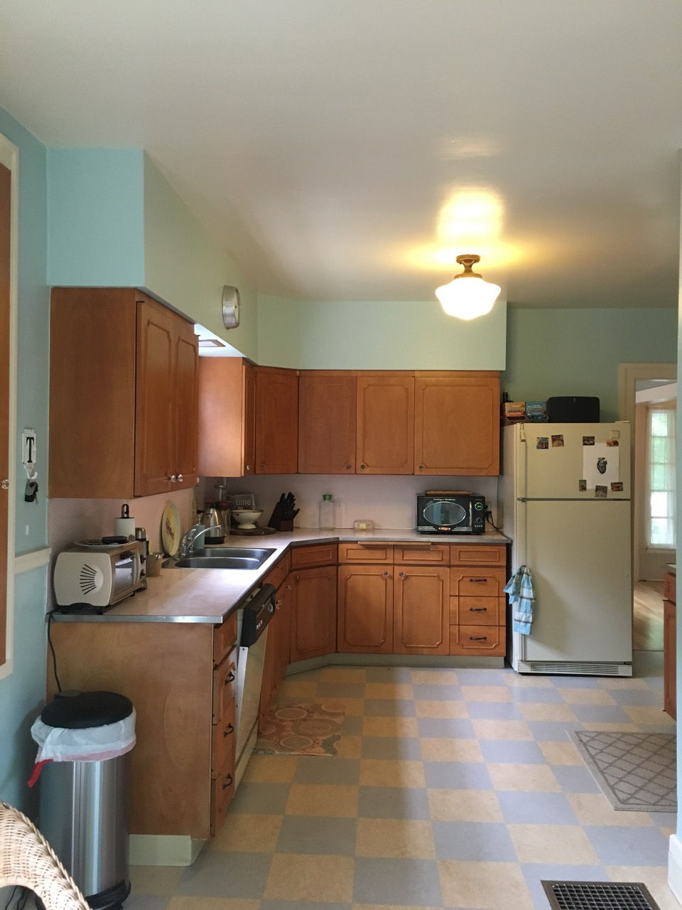
He loved the original details in this historic home, except for the 1960's kitchen. Like so many others renovated in the late mid century, the kitchen felt out of place with pink formica counter-tops and plywood cabinetry.

Our challenge was to transform an unwelcoming kitchen into a space that honored the architectural integrity of the home. Our client had already brought on Cutting Edge Cabinetry to help with the layout of the cabinets. We made recommendations regarding the design, finish and details of the cabinetry. We suggested using beautiful and period appropriate details such as inset cabinetry, historical moldings and sculpted furniture bases for added interest. Our client loved the recommendations and we moved forward with this plan.

The layout for the space was changed in subtle but clever ways to enhance the function of the space. The refrigerator shifted to the adjacent wall and a new bar niche was included on the wall between the stove and a nearby mudroom. It was also proposed to include a new pass through to bring light and connectivity between the kitchen and dining room. These changes brought modern comfort to this historic home, while returning the space to its original style.


With this space plan in place, we began to design the look and feel of the space. Working closely with the client, we chose materials and fixtures that felt period appropriate, yet still brought a modern update. The final materials we chose were a beautiful marble-like quartz counter-top, paired with a classic tile backsplash of Carpiccio Cashmere Grey from Ann Sacks. For the wall color, we chose the complimentary Moonshine hue from Benjamin Moore. For the flooring, new narrow plank flooring was selected to tie seamlessly with the flooring in the rest of the home.

The design restored the home's character while still retaining modern amenities. Fixtures evocative of a turn of the century home included a Rohl wall-mounted faucet, apron sink and gas stove. Period appropriate lighting from Restoration Hardware and Rejuvenation were also added, for a classically modern touch.
Once dark and dated, the new kitchen now feels timeless and refreshing- the final puzzle piece for a truly lovely classic home.
Stay tuned next week when we introduce the bathroom transformation in this classic home. It's another spectacular transformation...


