We recently introduced an office furnishing project in a profession that has become very in-demand in the last year and a half. No, not real estate. Not construction. Not Amazon delivery. Therapy. Who doesn't need therapy these days?!!
If you missed the previous post, you can find it here. To recap a bit, we were approached by a repeat client to help design & furnish a professional office and reception area. We were happy to help and got to work on laying out the two spaces right away.
Here's a refresh on the space plans for the office & reception area (office on the left and reception on the right):
For the office, we were proposing an L shaped desk, a loveseat & comfy chair for patients, a tall bookcase for all of the client's books and a few side tables & lamps to make the space cozy & bright.
For the reception, we proposed 4 comfortable chairs along the back wall with 2 larger chairs nestled under a large mirror to bounce light around the space. A round coffee table & a few side tables would provide a spot for patients to set their items down and/or space for magazines.
Our client really liked these plans and we got to work on the design.
Office Design

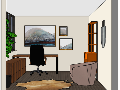
For the design of the office, we wanted to select furnishings that stayed true to our Inspiration Board aesthetic (found in the Intro post). The look was minimal & modern with sleek greys, touches of black & warm neutrals and pops of soothing blues & rich burgundy red. To achieve the look, we chose a rich walnut topped L-shaped height adjustable desk, a neutral loveseat sofa, a beautiful grey leather swivel chair and an elegant, cognac leather-wrapped bookshelf.


As far as decor, we brought in some soothing blues, and some rich burgundy reds via the artwork and accessories. A beautiful table lamp & a unique mirror provided some interest & would keep the space light and bright.
Our client loved almost all of the aspects of the design, however they decided that despite the nice look of the camel-colored hide rug, there could be some potential patients who would not appreciate the animal hide in the space. So we respecified this piece and chose a beautiful neutral wool rug from our favorite local rug shop, SMG Collective. After swapping out the rug, we all liked the design even more! We were ready to move forward with this design plan.
Reception Area Design
For the reception area design, we wanted to keep a similar look & feel as the client's private office design. We chose a beautiful burgundy red for the waiting area chairs, warm wood coffee & end tables and some fun accents such as a black & white striped side table. This played off of the eye catching art pieces that the client and colleagues had collected throughout the years.

Here are some images of the space in the 3D model.
Our client loved the design for the reception area too! Next steps were to finalize the orders with all the vendors & get ready for the install. It all went smoothly and the office looked great! When the pandemic forced everyone to stay home, suddenly everyone turned to telehealth & zoom calls. We figured it was a great time to get into the empty office & capture some photos. Are you ready to see the final result?
Final Office Photos


Such a beautiful & calm space! The large windows keep the space light & bright and all the cozy seating really make this a comfortable office!
Final Reception Photos


It turned out beautifully! Sophisticated yet so comfortable with great circulation all around the space.
Now this office was ready to provide a safe & comfortable space for patients. That is until the pandemic forced everyone to stay home last year. Hopefully some day we'll all get back to going into offices & places safely again. Until then, stay safe & healthy!


Коментарі